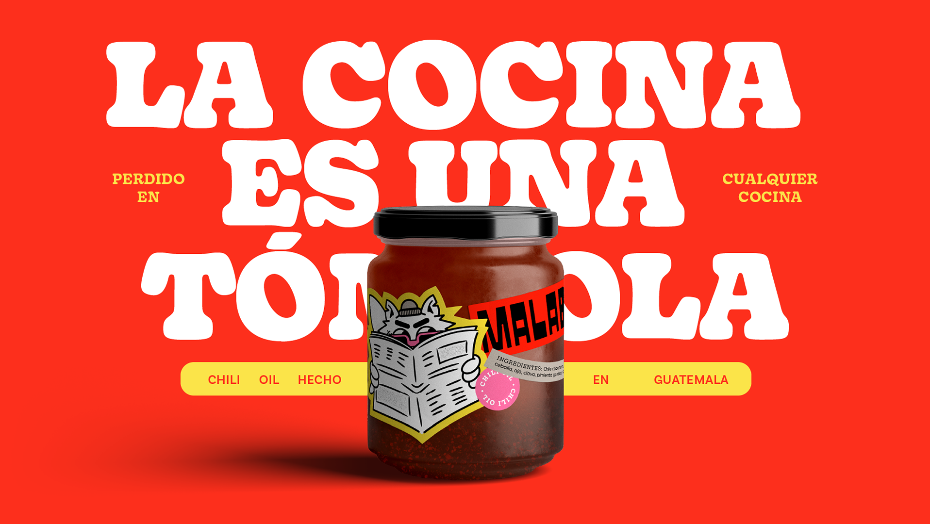
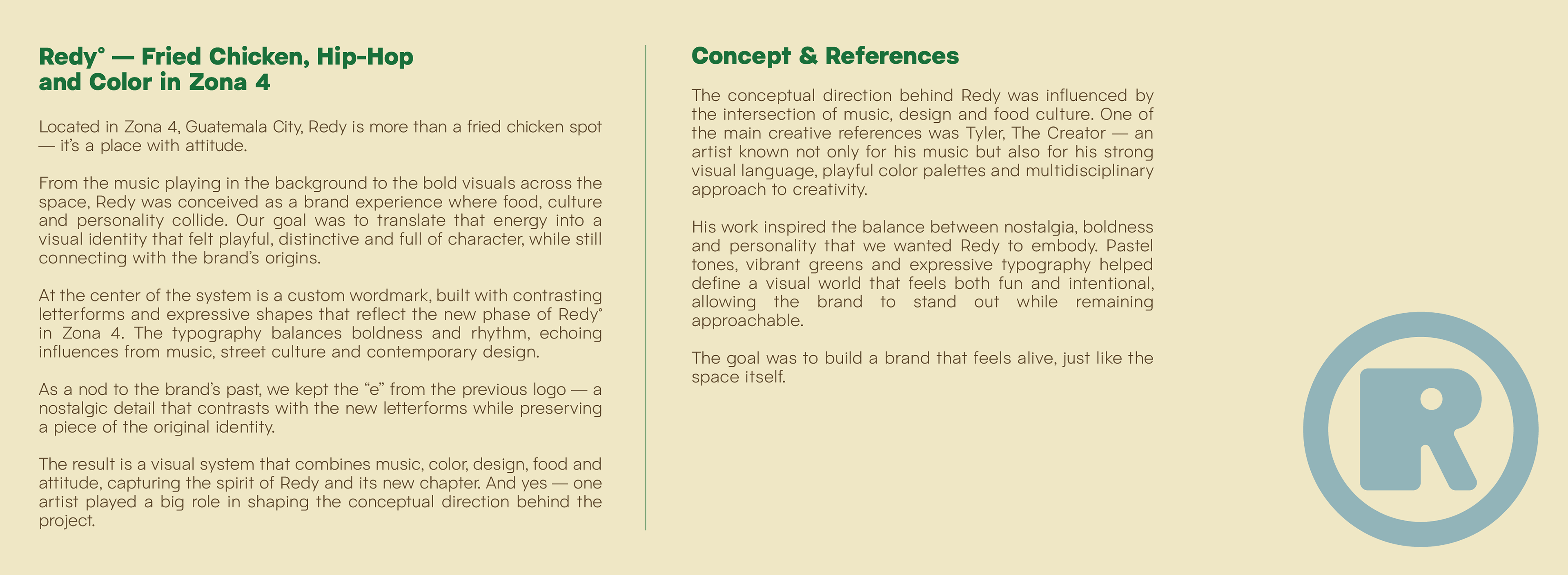
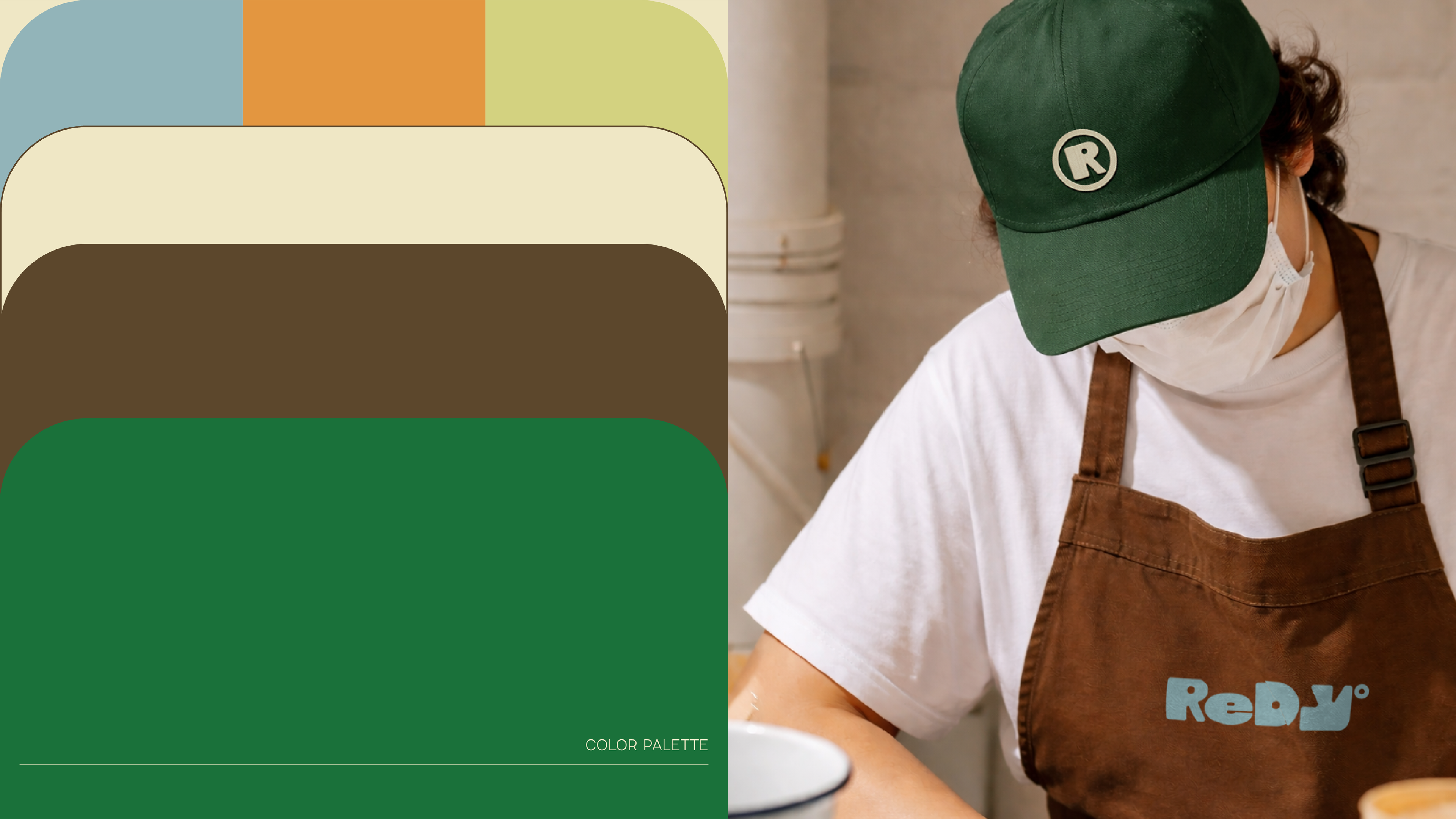
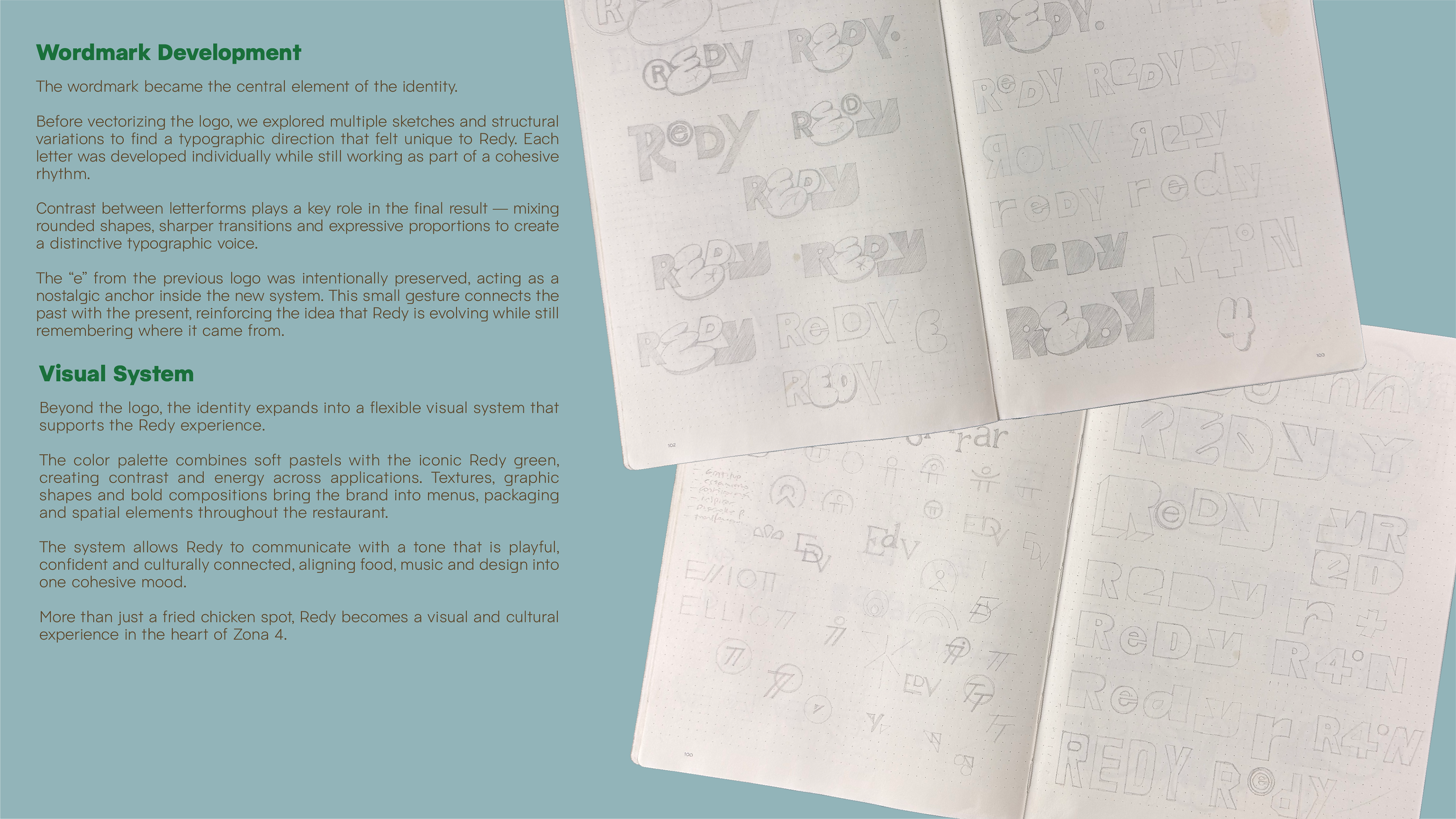
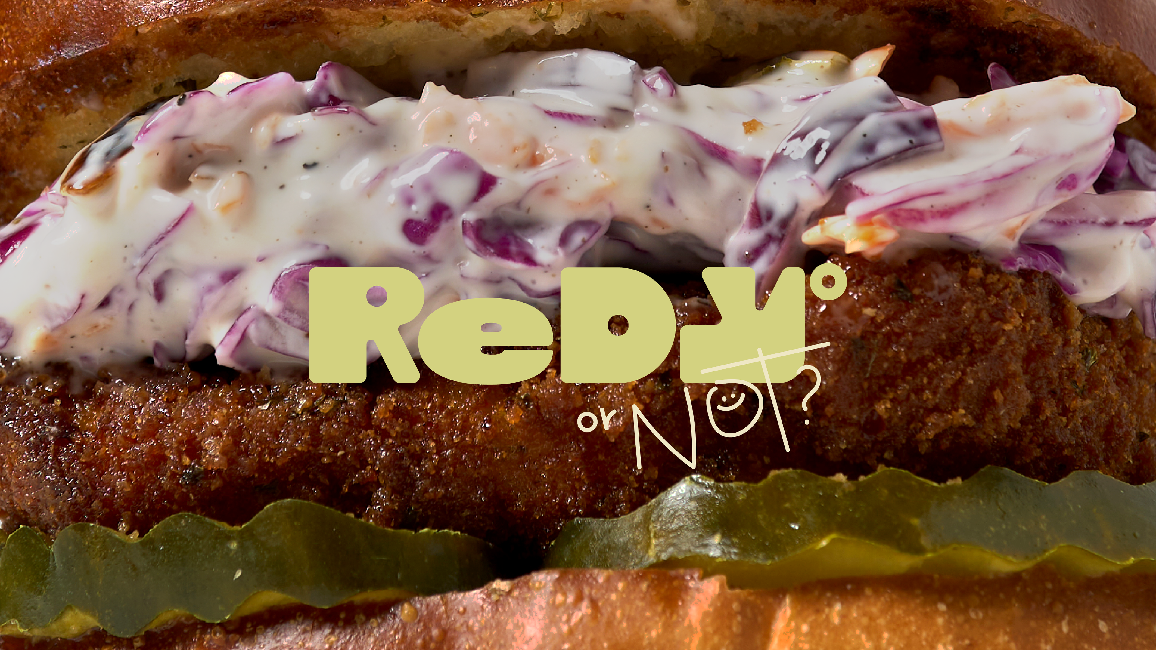
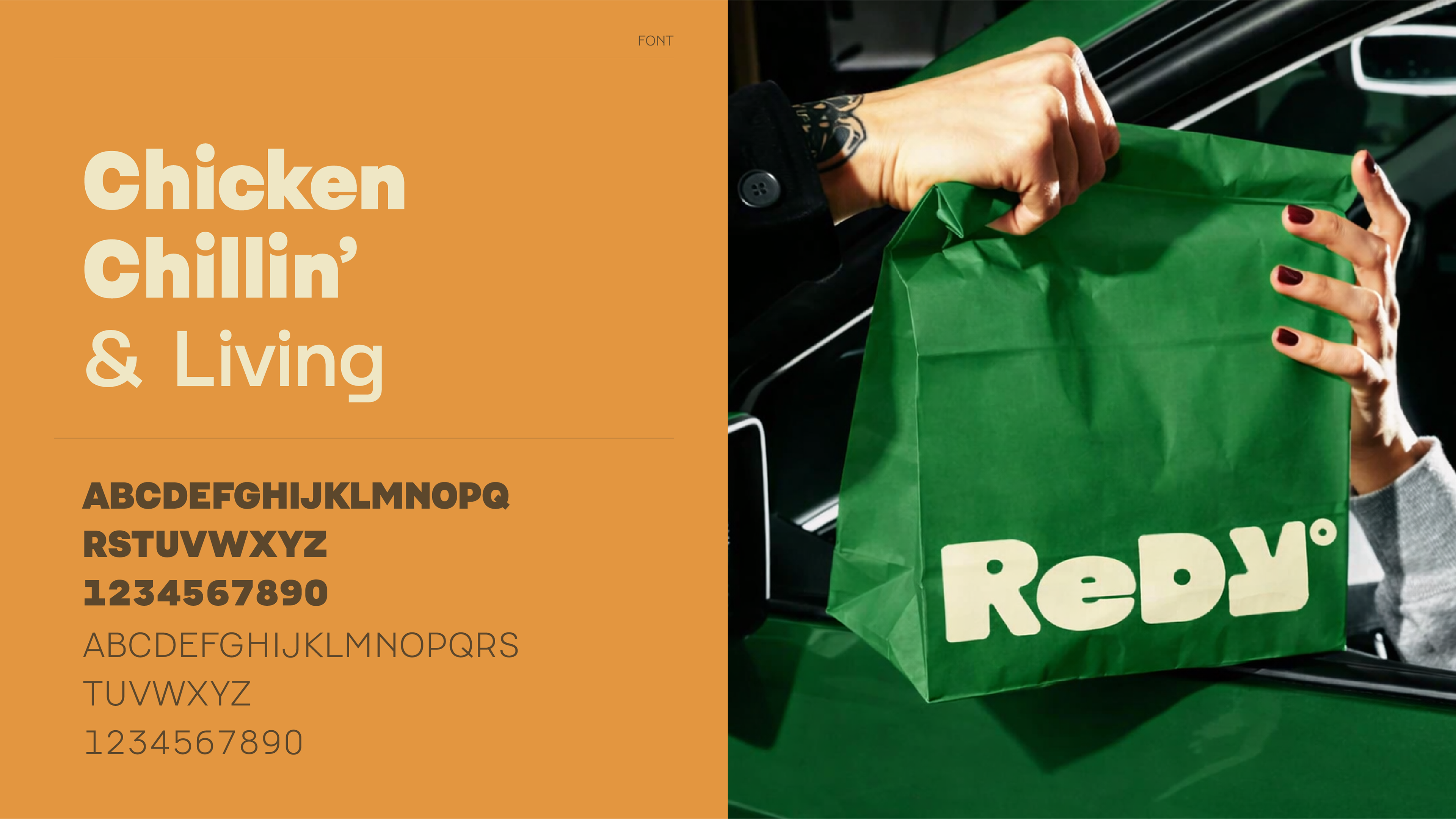
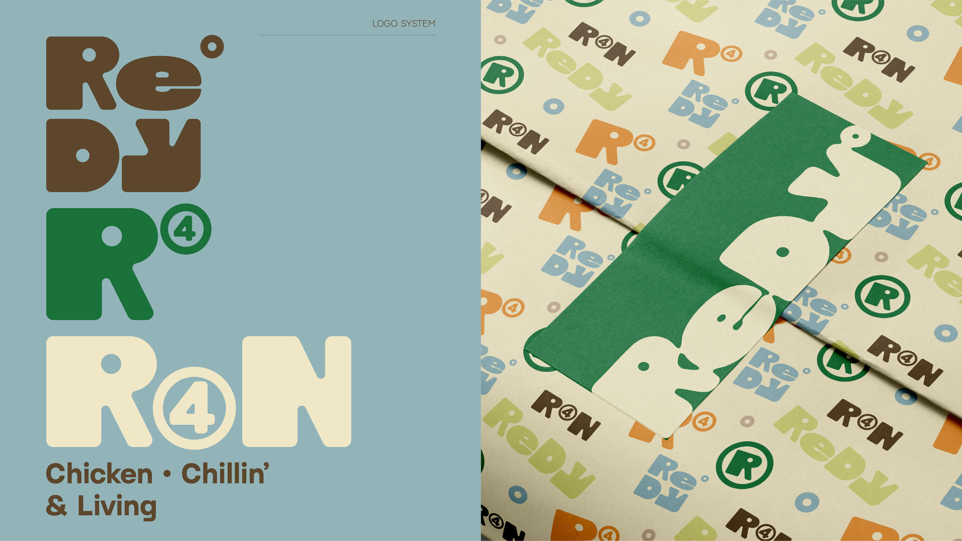
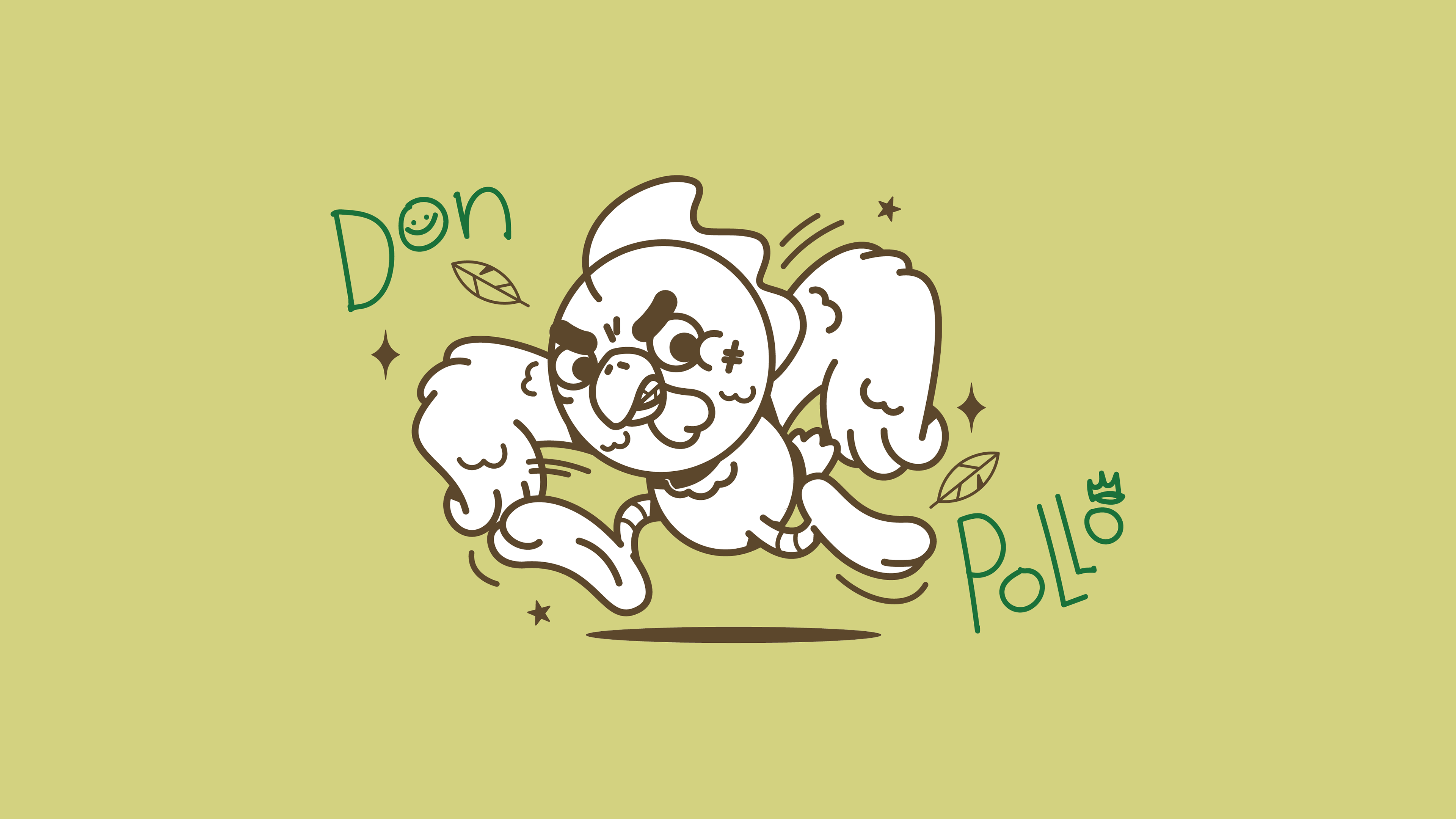
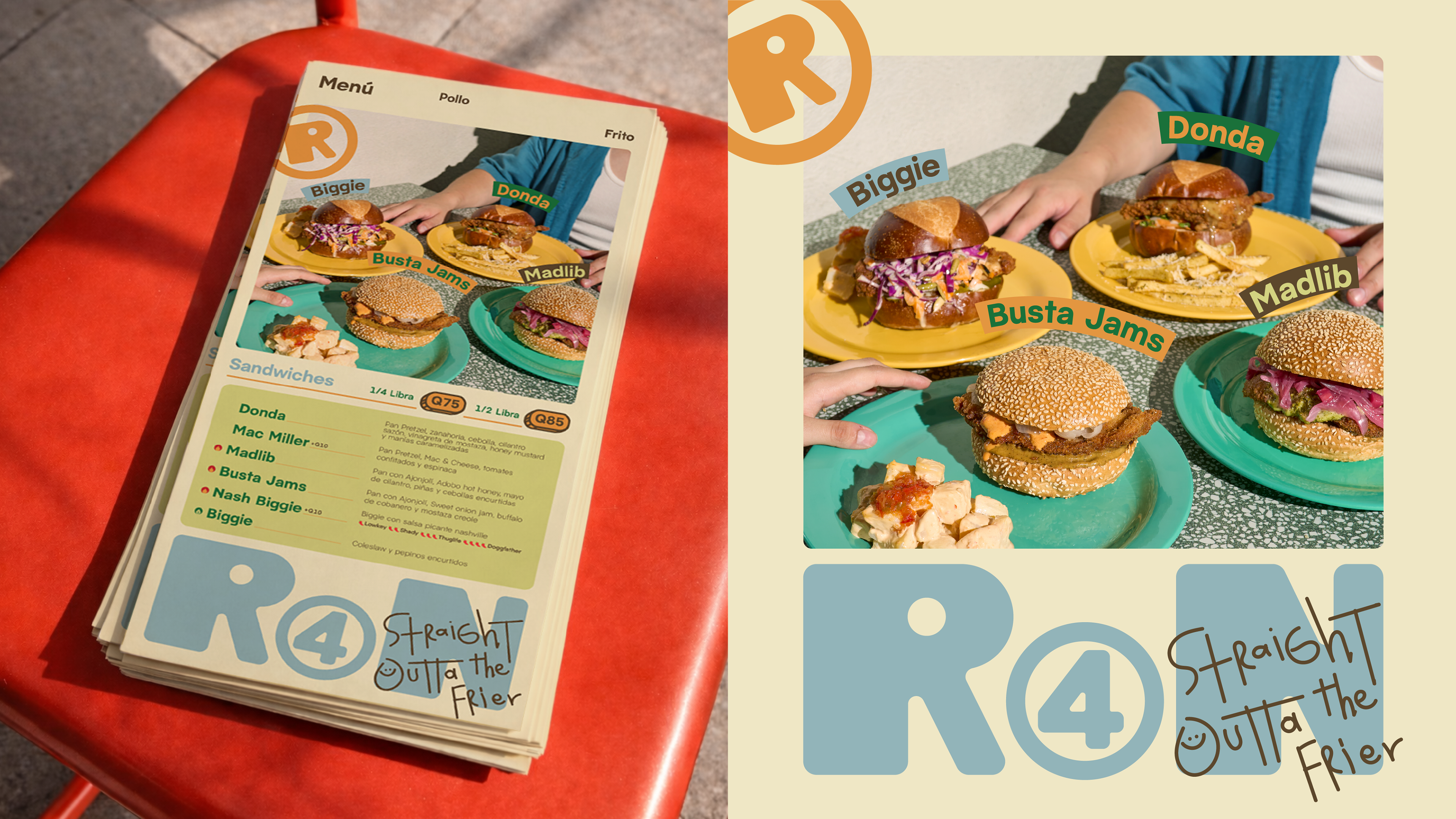
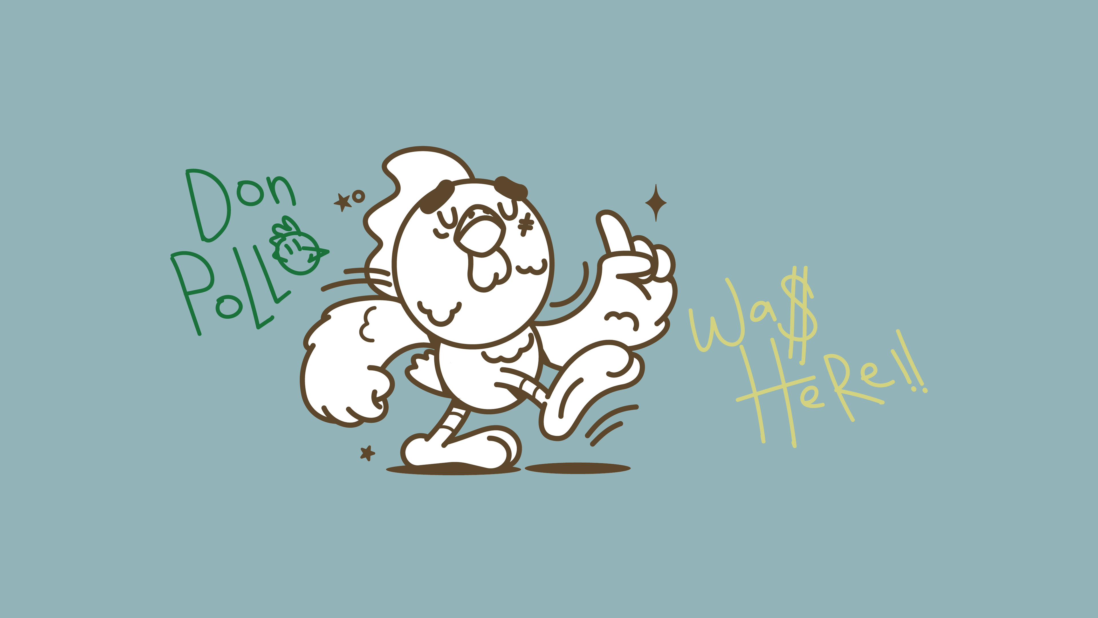
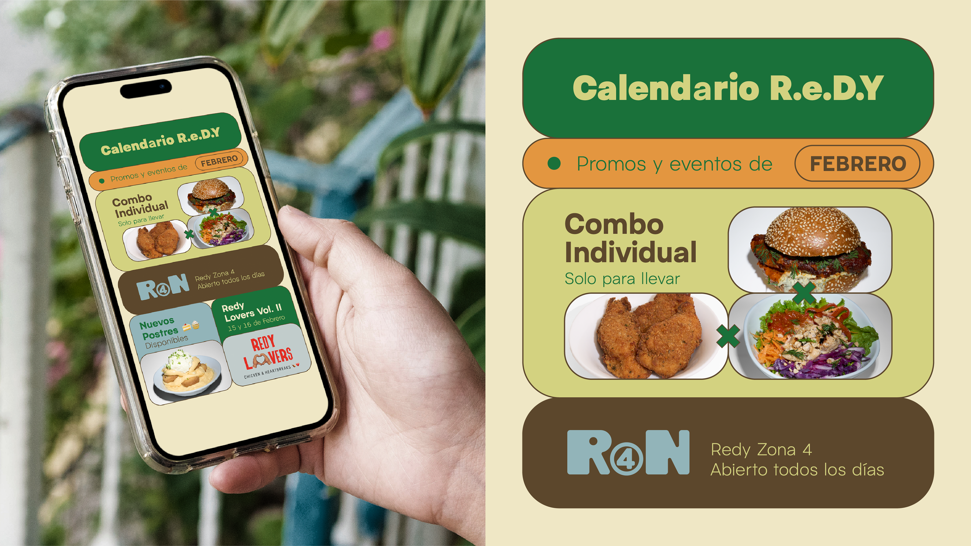
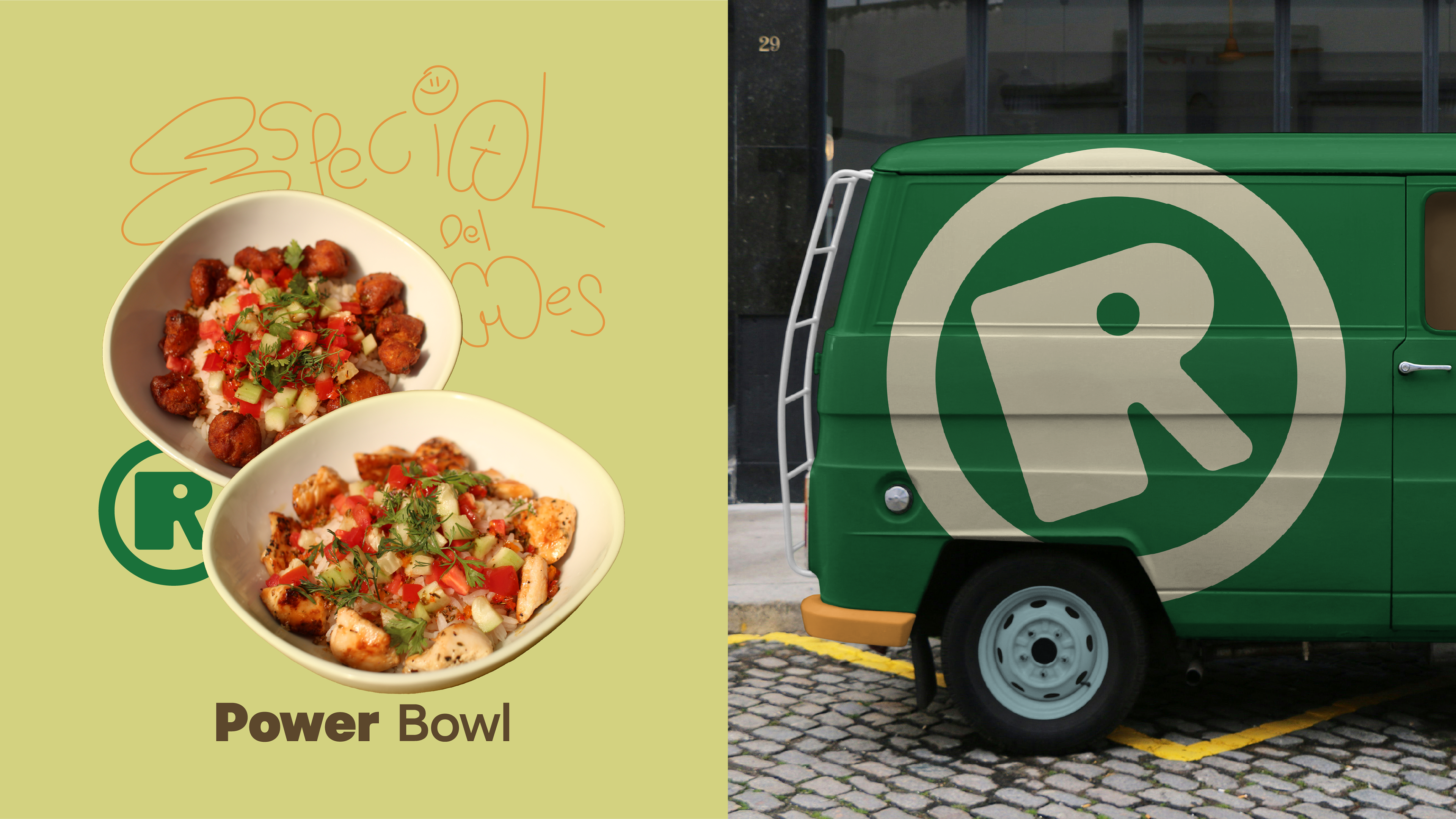
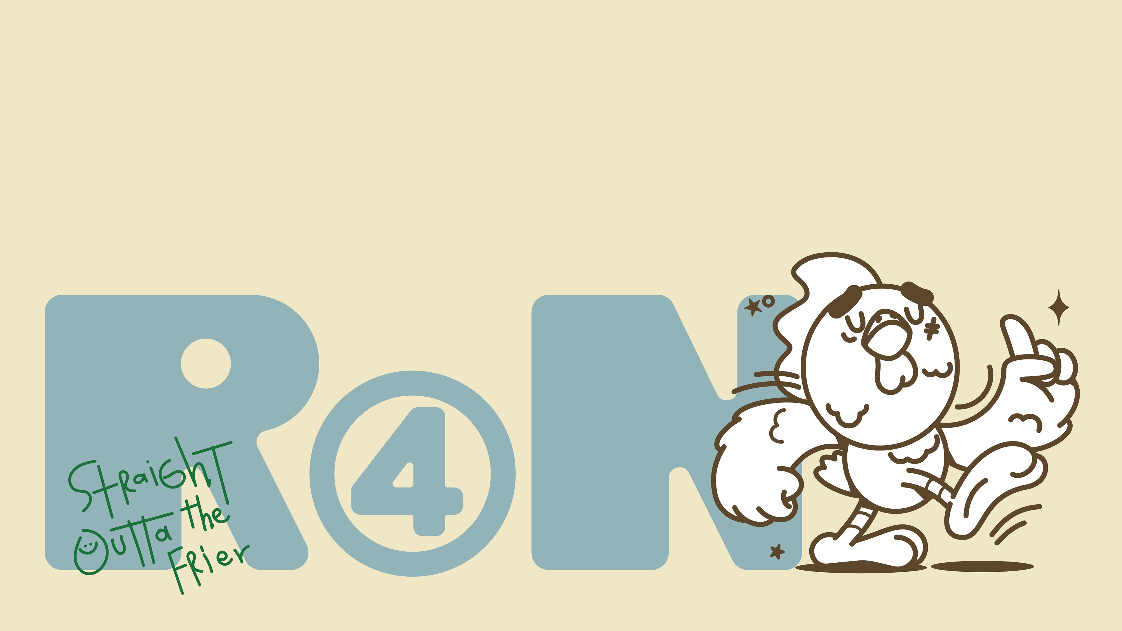
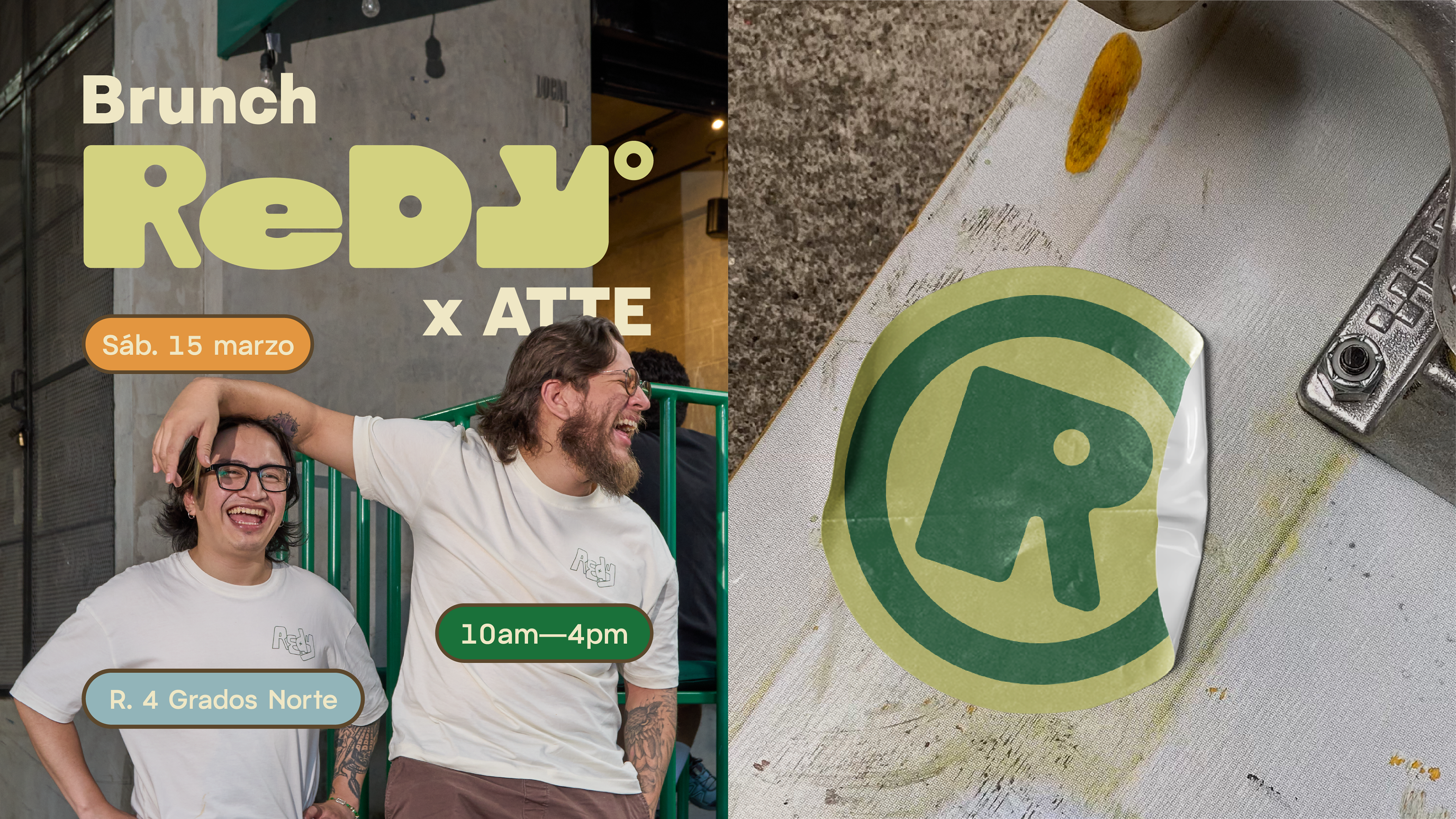
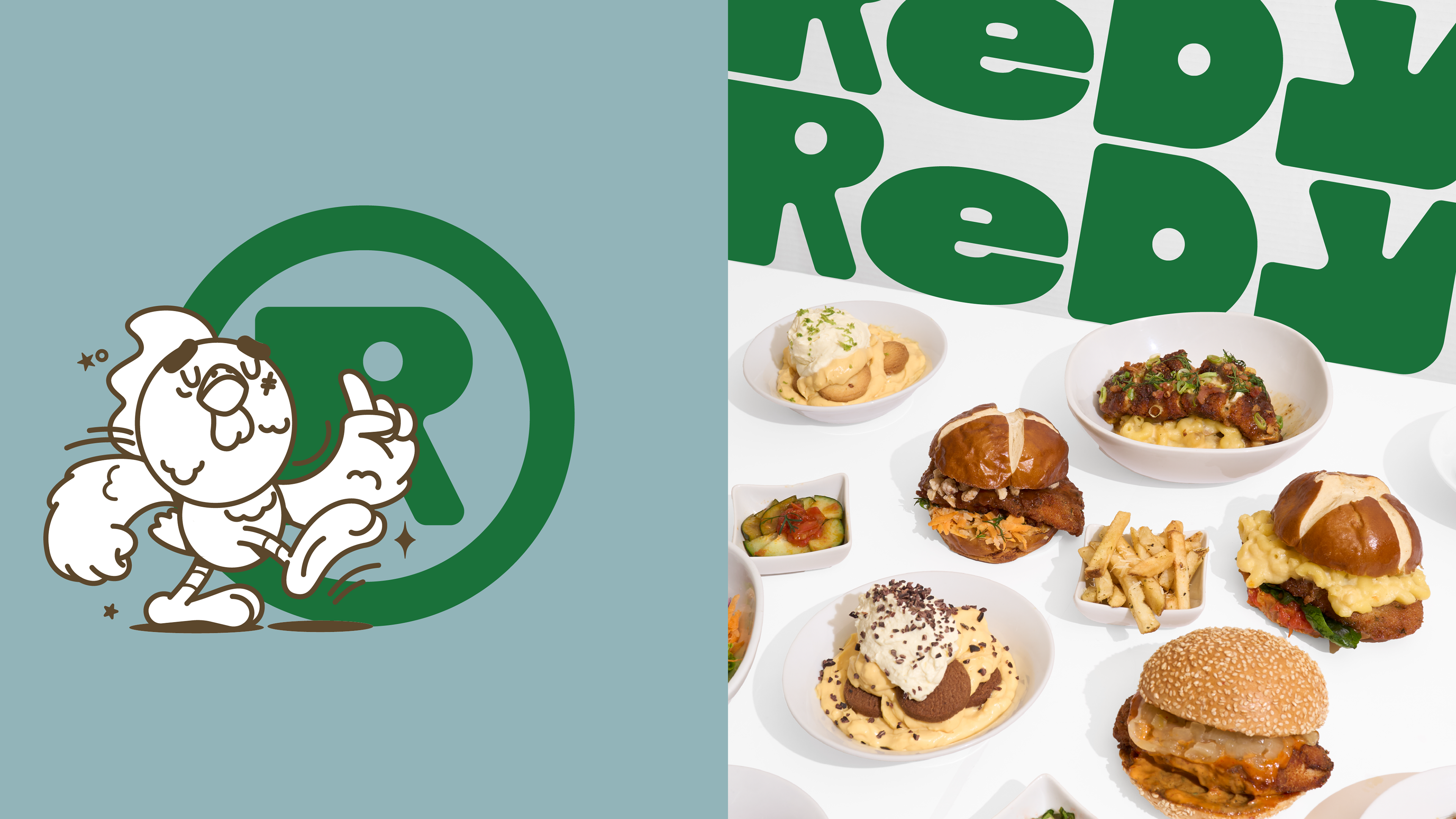
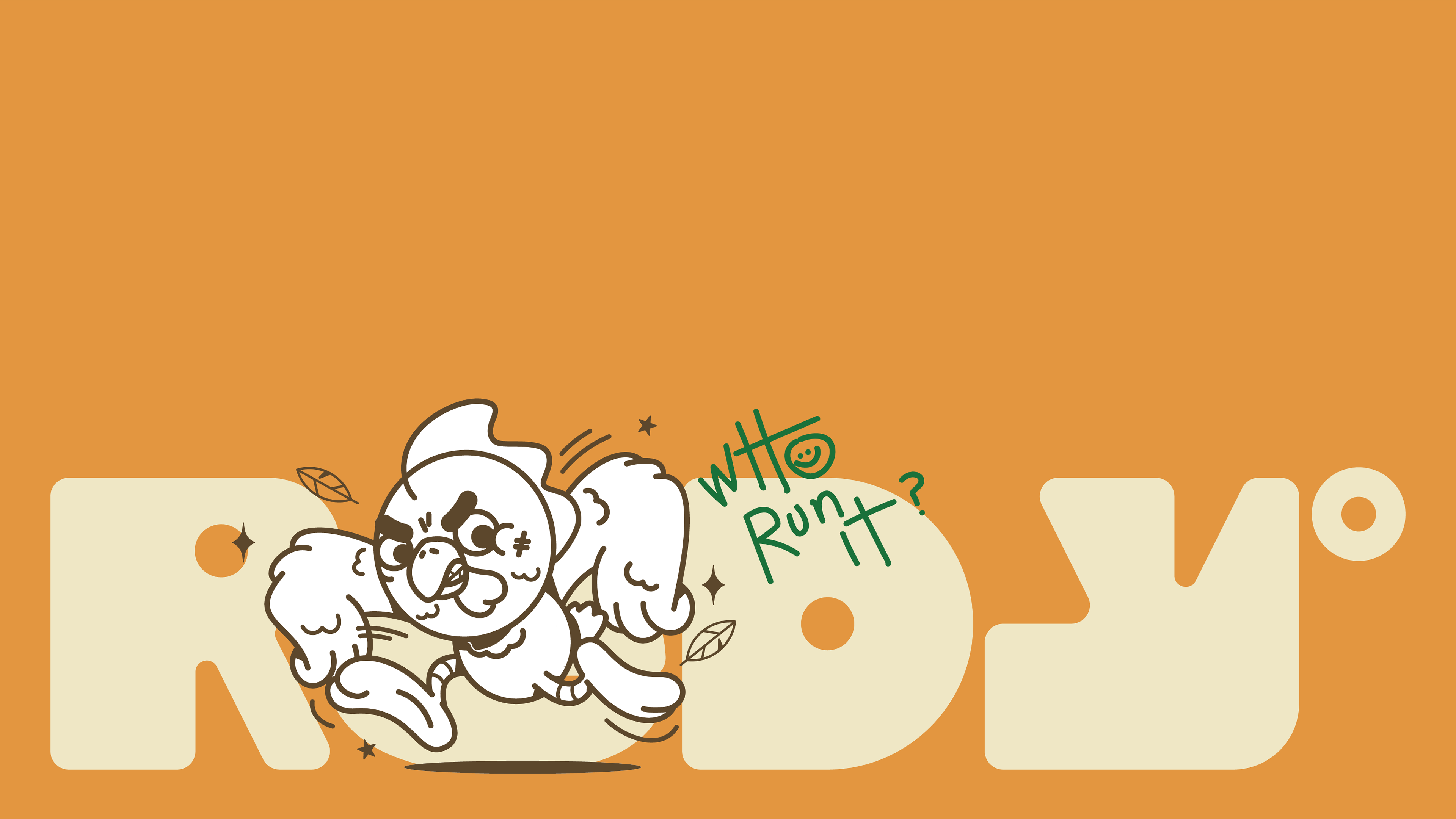
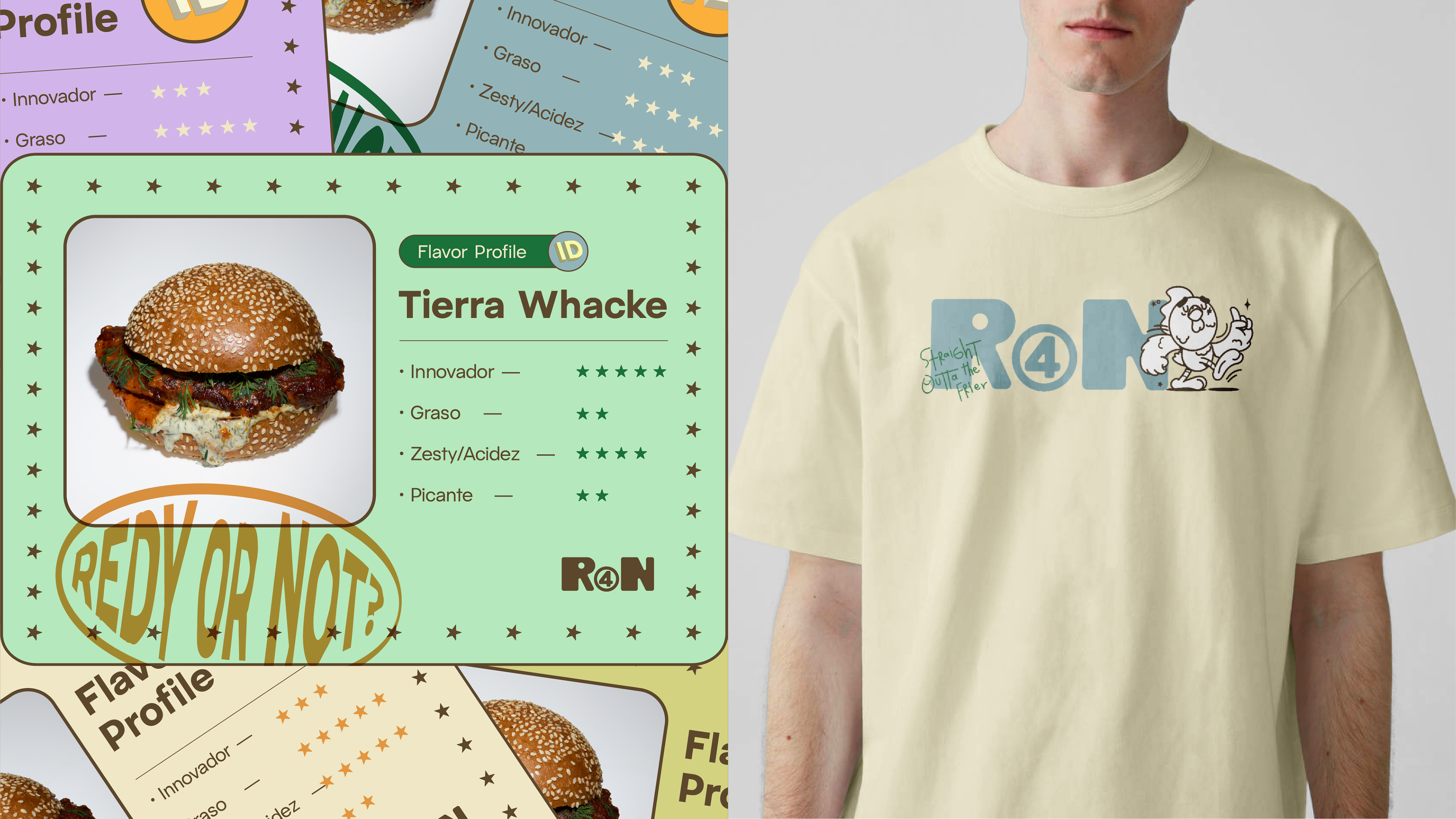
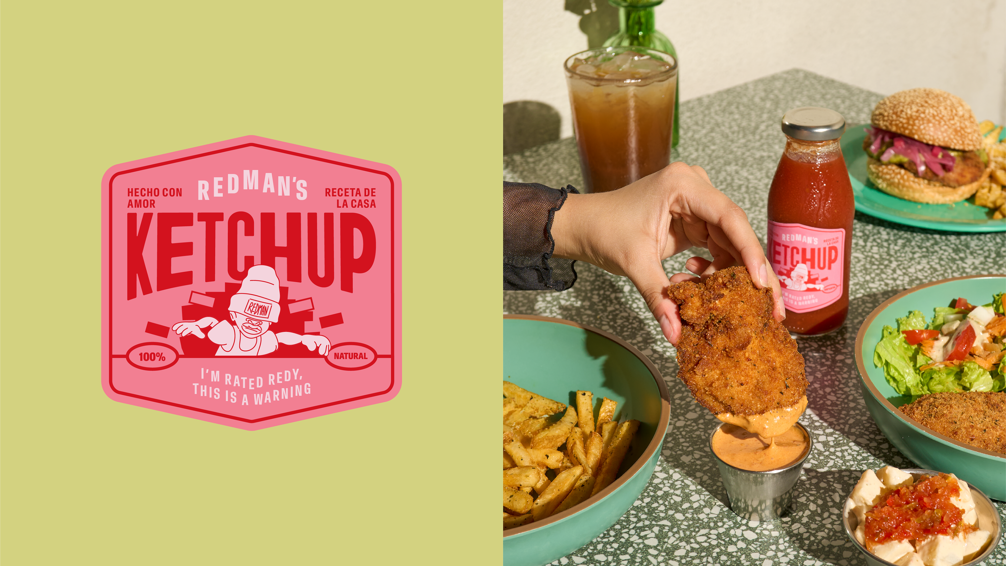
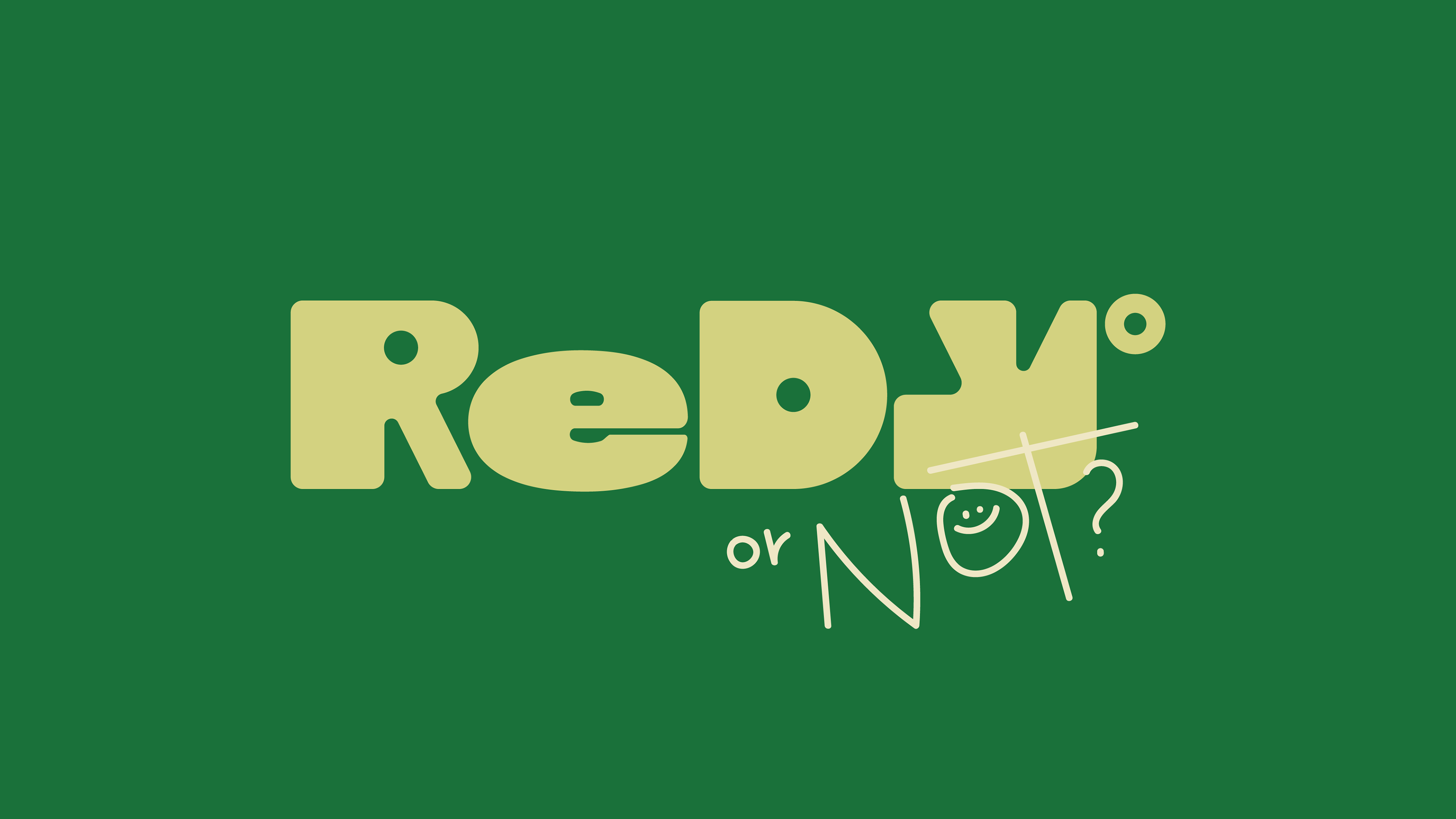
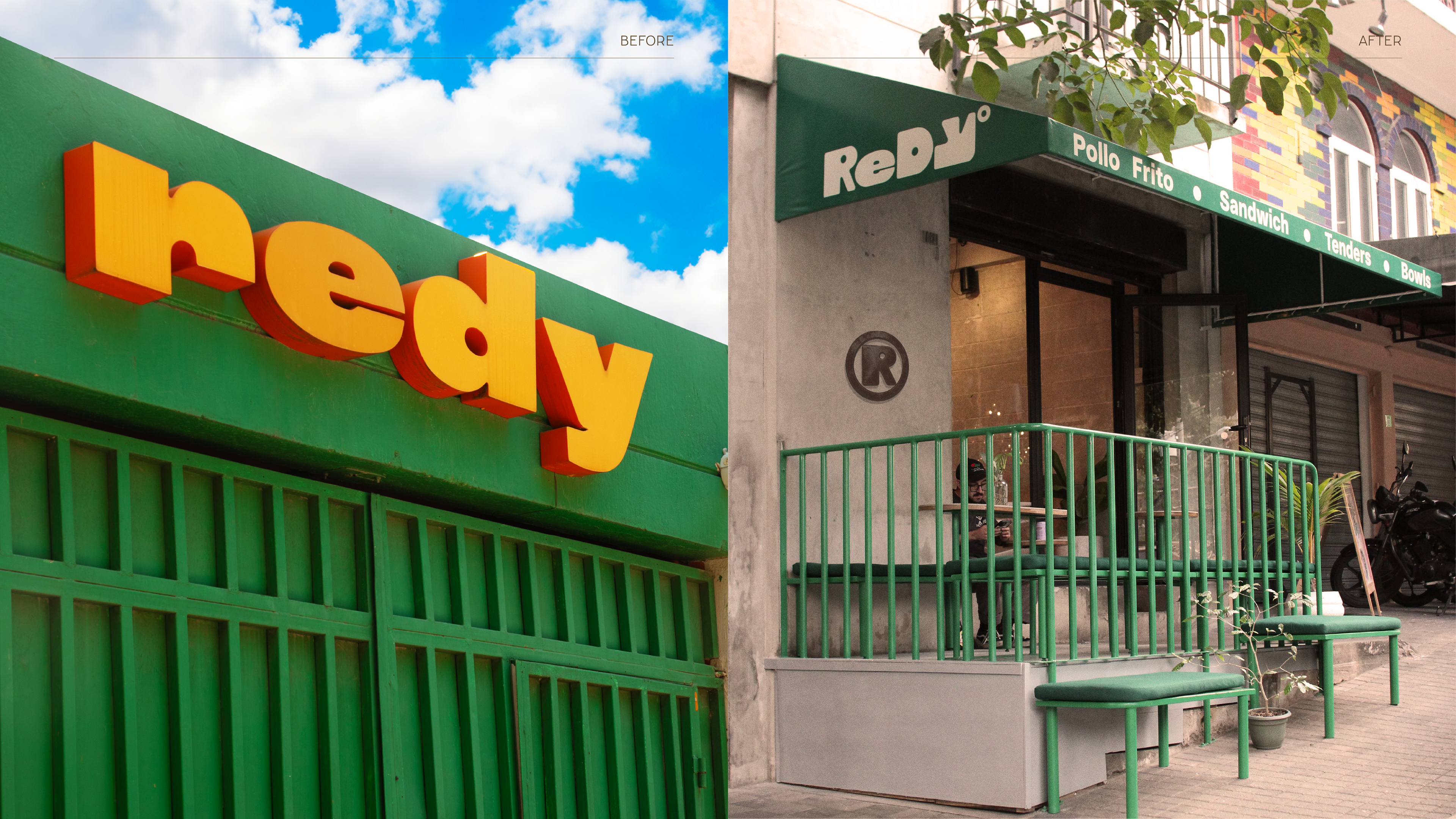
🍗 Zona 4, fried chicken and hip-hop 🎵 Redy isn’t fast food — it’s an experience. A warm space with personality and a communication style full of color. We designed a custom wordmark and a solid visual system with contrast and distinctive forms that represent the new phase of Redy° in Zona 4. We leaned into nostalgia by keeping the letter “e” from the previous logo — a small detail that contrasts and integrates into the new design as a nod to our origins: Started from the bottom, now we’re here. Music, design, color, food and attitude all in one mood. Can you guess which artist inspired part of the conceptual direction? Drop it in the comments. 👀🍗